The Complete Guide to Selecting Fabrics for Quilting
Choosing the right fabrics can make or break your quilting project. While it's tempting to grab every gorgeous print that catches your eye, successful quilting requires understanding fabric quality, color relationships, and how different materials work together in your finished piece.
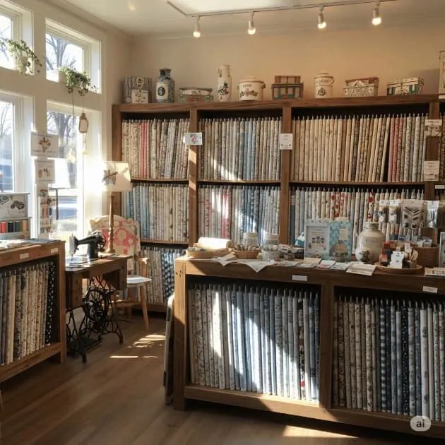
Walking into a fabric store can feel overwhelming. Bolts of gorgeous prints stretch from floor to ceiling, each one seemingly perfect for your next quilt project. But choosing the right fabrics goes far beyond falling in love with a pretty pattern. The fabrics you select will determine whether your finished quilt becomes a cherished heirloom or a frustrating reminder of lessons learned the hard way.
Why Cotton Reigns Supreme
Most experienced quilters swear by 100% cotton, and there's good reason for this loyalty. Cotton quilting fabric has the perfect balance of stability and flexibility. It holds its shape during cutting and piecing, yet drapes beautifully in the finished quilt. The fibers grip each other naturally, preventing seams from coming apart under stress.
When shopping, you'll notice a significant difference between quilting cotton and apparel cotton. Quilting cotton typically has a tighter weave and slightly stiffer hand. This firmness makes it easier to achieve precise quarter-inch seams and crisp points. Apparel cotton, while beautiful, often lacks the structure needed for accurate piecing.
Thread count matters more than you might think. Quality quilting cottons usually have a thread count between 60-80 threads per square inch (Brackman, 2019). Higher thread counts can make hand quilting more difficult, while lower counts may lack durability. The sweet spot provides enough density for stability without making your needle feel like it's fighting through armor.
Recognizing Quality Fabric
Learning to identify high-quality fabric becomes second nature with experience, but beginners can master a few key indicators. First, examine the grain. Quality fabric maintains consistent grain lines with minimal distortion. When you pull gently on the bias, it should have some give but spring back to its original shape.
The hand of the fabric tells you volumes about its quality. Good quilting cotton feels substantial without being thick or stiff. It should have a slight texture that helps it grip other fabrics during piecing. Avoid fabrics that feel limp, overly soft, or have a slippery surface.
Color bleeding can ruin months of work, so testing is crucial. Before starting any project, test questionable fabrics by placing a small piece in hot water. Dark fabrics, especially reds and purples, are notorious for bleeding (Fassett & Lauer, 2020). If you notice any color in the water, pre-wash the fabric or choose a different one for your project.
Check the print quality by looking closely at pattern edges. Sharp, clean lines indicate proper printing techniques. Blurry edges or colors that don't align properly suggest lower manufacturing standards and may indicate other quality issues.
Understanding Value in Quilt Design
Value refers to the relative lightness or darkness of fabrics, and it's arguably more important than color in creating successful quilts. Even the most carefully planned color scheme can fall flat if the values are too similar. Your eye needs contrast to distinguish between different elements of the design.
When evaluating fabric combinations, step back or squint to blur the details. This helps you see the overall value relationships without being distracted by specific colors or patterns. Many quilters take photos of their fabric selections and convert them to black and white to check value distribution.
Light fabrics serve as breathing room in busy designs, while dark fabrics provide grounding and definition. Medium values bridge the gap and create smooth transitions. Most successful quilts incorporate all three value ranges, though the proportions vary based on the desired effect.
Working with Prints and Patterns
Scale plays a crucial role in how prints work together. Large-scale prints can overwhelm small quilt blocks, while tiny prints may read as solids from a distance. Understanding how different scales interact helps create visual interest without chaos.
Small-scale prints, often called "blenders," work beautifully as transitional fabrics. They add subtle texture without competing for attention. Medium-scale prints can serve as focal points in blocks, while large-scale prints work well in sashing or borders where their full beauty can be appreciated.
Directional prints require special consideration. Stripes, plaids, and obviously directional patterns can create stunning effects when used thoughtfully, but they can also fight against your design if not carefully planned. Consider how the fabric will look when cut into smaller pieces and whether the direction will remain consistent throughout the quilt.
Tone-on-tone fabrics offer the best of both worlds. They provide subtle pattern interest while functioning almost like solids in your overall design. These fabrics are workhorses in many quilters' stashes because they coordinate with almost everything.
Building a Balanced Color Palette
Color selection often intimidates quilters, but understanding a few basic principles makes the process much more manageable. Start with a color scheme you love, whether it's inspired by a favorite fabric, a photograph, or simply colors that make you happy.
The 60-30-10 rule provides a helpful framework (Martin, 2018). Use your dominant color for about 60% of the quilt, a secondary color for 30%, and accent colors for the remaining 10%. This creates balance while preventing any single color from overwhelming the design.
Don't forget about neutrals. Creams, tans, grays, and soft whites serve as resting places for the eye and help other colors shine. Many quilters underestimate the power of a well-placed neutral to elevate an entire color scheme.
Temperature plays a role in color relationships. Warm colors (reds, oranges, yellows) advance and energize, while cool colors (blues, greens, purples) recede and calm. Mixing temperatures adds complexity and interest to your palette.

Special Considerations for Different Fabric Types
Batiks deserve special mention in any quilting fabric discussion. These hand-dyed fabrics from Indonesia offer incredible depth and richness. The wax-resist process creates subtle variations that add movement and life to quilts (Noble, 2017). However, batiks can be slightly more challenging to work with due to their dense weave and tendency to fray less than regular cotton.
Hand-dyed fabrics bring unique character to quilts. No two pieces are exactly alike, creating one-of-a-kind results. When working with hand-dyed fabrics, embrace the variations rather than fighting them. These subtle differences add to the handmade charm of your finished quilt.
Reproduction fabrics capture the spirit of historical quilts. If you're creating a period-appropriate quilt or simply love vintage aesthetics, reproductions offer authentic-looking options with modern quality standards. Many reproduction lines include carefully researched color palettes that work beautifully together.
Preparing Your Fabrics
The pre-washing debate continues to divide quilters. Those who pre-wash argue it prevents shrinkage, removes excess dyes, and eliminates sizing that can interfere with quilting. Those who don't pre-wash appreciate the slight stiffness that makes cutting and piecing easier, plus they enjoy the subtle puckering that occurs when the finished quilt is first washed.
If you choose to pre-wash, use cool water and mild detergent. Hot water can cause more shrinkage than necessary and may set wrinkles that are difficult to remove. Add a color catcher sheet to prevent any dye migration between fabrics.
Regardless of your pre-washing preference, proper pressing is essential. Use a dry iron on the cotton setting, and press rather than iron. Ironing involves moving the iron back and forth, which can distort the fabric's grain. Pressing uses an up-and-down motion that smooths wrinkles without stretching.
Selecting Backing and Binding
Backing fabric selection deserves as much thought as your quilt top. The backing needs to be large enough to extend 2-4 inches beyond your quilt top on all sides, depending on your quilting method. Wide-back fabrics (108-120 inches) eliminate piecing for most quilts, but they're more expensive and offer fewer design options.
Pieced backings let you incorporate coordinating fabrics or use up larger scraps from your quilt top. Keep pieced backing designs relatively simple to avoid interfering with your quilting pattern. Large blocks or strips work better than complex piecing that might create bulk or distortion.
Binding fabric should complement your quilt without overpowering it. Many quilters choose a fabric that appears in the quilt top, creating a cohesive look. Others prefer a neutral that frames the quilt without competition. Double-fold binding made from fabric cut on the straight grain provides the best durability for quilts that will be used and washed regularly.
Smart Shopping Strategies
Building a fabric stash takes time and planning. Start with basics: a range of neutrals, a variety of values in your favorite colors, and several good blender prints. These foundations will serve you well in multiple projects.
Shop with a plan, but remain open to opportunities. If you find a fabric you absolutely love at a great price, buy enough for a complete project plus extra for binding and potential mistakes. It's heartbreaking to fall short of fabric for a quilt you love.
Consider the source when shopping. Local quilt shops offer the advantage of seeing and feeling fabrics before purchasing, plus the expertise of knowledgeable staff. Online shopping provides access to a wider selection and often better prices, but you're gambling on color accuracy and fabric quality.
Pay attention to fabric collections. Manufacturers spend considerable time and effort creating fabrics that work well together. While you don't need to use an entire collection in one quilt, these coordinated groups take the guesswork out of color and pattern selection.
Common Mistakes to Avoid
Choosing fabrics that are too similar in value creates quilts that lack definition and impact. When in doubt, add more contrast rather than less. Your quilt blocks should remain visible and distinct in the finished quilt.
Ignoring scale relationships can create visual chaos. If you're using one large-scale print, balance it with smaller scales rather than competing with another large print. Think of scale like volume levels – you need variation to create interest without overwhelming noise.
Falling in love with fabric before considering the project leads to poor matches. That gorgeous large-scale floral might be perfect for a border but terrible for small blocks where the pattern gets chopped up into unrecognizable pieces.
Skimping on fabric quantity is a false economy. Running short forces you to make substitutions that might not work as well, or worse, leaves you with an unfinished project. Buy a little extra – you can always use leftovers in another project.
The Final Decision
Ultimately, the best fabric choices are the ones that make you excited to start quilting. Technical considerations matter, but if you don't love your fabrics, you'll struggle to maintain enthusiasm through the many hours required to complete a quilt.
Trust your instincts while applying these guidelines. If a combination feels right to you, it probably is. Quilting is an art as much as a craft, and your personal aesthetic deserves to shine through in your fabric selections.
Remember that every quilt is a learning experience. Even experienced quilters sometimes make fabric choices they later regret. Each project teaches you something new about color, pattern, and personal preference. Embrace the journey, learn from your mistakes, and keep creating beautiful quilts that reflect your unique style and vision.
The perfect fabric selection creates quilts that bring joy for generations. Take time to choose thoughtfully, prepare carefully, and quilt with confidence. Your future self – and anyone lucky enough to receive one of your quilts – will thank you for the extra attention to these important details.
References
Brackman, B. (2019). Understanding Quilting Cotton: A Technical Guide. American Quilter's Society.
Fassett, K., & Lauer, L. (2020). Color and Fabric in Quilting: Essential Techniques. Martingale Press.
Martin, N. (2018). The Quilter's Color Palette: Design Principles for Success. C&T Publishing.
Noble, M. (2017). Batik Fabrics in Modern Quilting. Stash Books.
Bryan House Quilts (2023). Quilters Color Wheel Made Just for You.
Additional Resources
- Quilting Arts Magazine: Technical fabric guides and reviews
- Modern Quilting Guild: Fabric selection workshops and resources
- American Quilter's Society: Standards and best practices documentation